Continuous improvement is a philosophy that we apply to all areas of CM, and our User Interface is no exception.
After extensive feedback, earlier this year we made a big change to our UI, moving the navigation bar from the side to the top, and introducing tabs in our Workspace (which we are loving!). This change isn’t as drastic, but it’s also fueled by the feedback we’ve received from users since we made that first significant change.
Saving & Updating

Arguably, the most noteworthy change is addressing where sometimes when you’d click ‘Save’ or any other similar button, you wouldn’t be sure if you’d clicked it properly, or if it was doing anything. Now, you’ll see a small ‘loading’ symbol when it’s completing your request, as well as grey out the buttons while it finishes completing that request. No more accidental duplicate entries! Or uncertain waiting around when nothing is happening.
What else was updated?
- We’ve improved our search buttons so they’re easier to see and use.

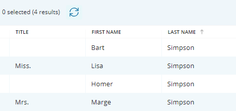
- Some of the colors and shading have been made more apparent so you can navigate around easier.

- Hovering over buttons clearly shows what you’re about to select.

- Freshened up our colors and made them more consistent.
- Updated some of our icons, mainly our Reports icon.
- Updated menus with a ‘sleeker’ look.
- Easier to identify scroll bars.
How do I find out what else has been updated?
Every month we write a brief summary of what we’ve fixed, updated, or added to our system. Want to be kept up to date? Check out our Feature update articles here.
How do I give feedback?
Have any comments or feedback that may help us improve our UI?
We’d love to hear them! Email us your thoughts at customersuccess@consultationmanager.com

